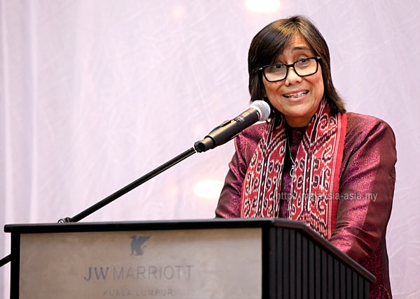
The Sarawak More To Discover Campaign for 2019 and 2020 was officially launched at the JW Marriott Hotel in Kuala Lumpur on the 16th October 2018 to media and tourism industry players from here .
A creative approach in tourism for the coming year, the Sarawak Tourism Board and also the Ministry of Tourism Sarawak came up with a simple and yet catchy logo for this campaign that is schedule to run for two years.
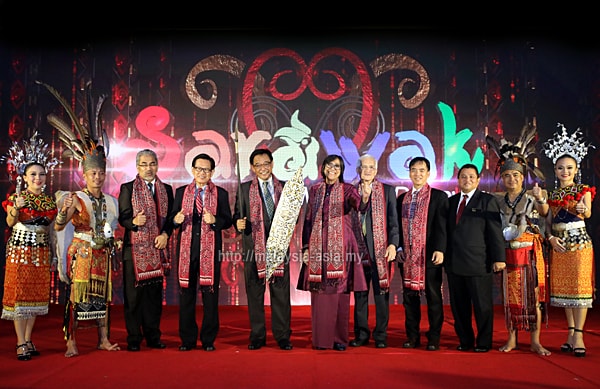 |
| The Sarawak Tourism Minister, CEO and other VIP’s during the launching in Kuala Lumpur |
What is Sarawak More To Discover?
While many wonder what the tagline means, it was created with simplicity and with an objective to focus on the unique culture, endless adventures, amazing nature, fascinating food and incredible festivals of Sarawak.
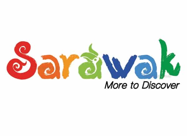
The More To Discover logo comprises of seven different colors, where each of them represents the elements and diversity that makes up Sarawak, otherwise known as the Land of the Hornbills.
If you notice the letter “a” in the logo, it has cleverly been replaced by the iconic Rhinoceros Hornbill bird, which is native to Sarawak.
And finally, the brush strokes of the More To Discover logo font portrays fun and friendliness, which is representing the unparalleled hospitality found all over Sarawak.
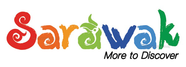 |
| The More to Discover Logo |
Sarawak More To Discover Logo Meaning
For those who really want to dive deeper into the logo meaning of the More To Discover tagline, here it is below;
S – The ‘S’ is in red color, which represents the Sarawak Flag, and the motif is part of the traditional design for the Dayak and Orang Ulu people of Sarawak.
A – The ‘A’ is orange in color, which represents the vibrant energy and strong spirit of the multi ethnic people in Sarawak.
R – The ‘R’ comes in the amber yellow color, which is also the color of the Sarawak flag, and represents supremacy of law and order, unity and stability in diversity.
A – The ‘A’ in green color is cleverly represented with the head of the Hornbill bird, and signifies the ‘Bumi Kenyalang’ or Land of the Hornbills.
W – The ‘W’ in blue color reflects the calmness of the ocean along Sarawak’s vast coastline.
A – The blue colored ‘A’ is the same as above, representing the ocean.
K – The ‘K’ also in a darker tone of green represents the lush tropical rainforest in abundance all over Sarawak.
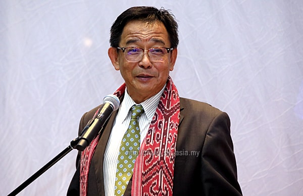 |
| Sarawak Tourism Minister Datuk Abdul Karim giving his talk during the launching |
Objective of More To Discover in Sarawak
The main mission is to brand Sarawak as a destination for culture, adventure, nature, food and festivals, .
The Sarawak Tourism Minister, Datuk Haji Abdul Karim Rahman Hamzah also jokingly mentioned that Sarawak is not your shopping destination. He also clearly stated that ‘If you want to do shopping, just visit Kuala Lumpur, Hong Kong or Singapore’.
Sarawak has always been one of the more unique states of Malaysia, and located on the island of Borneo, and is shared with Brunei and Kalimantan. The island is well known to the world simply as Borneo too.
With such unique flora and fauna, Sarawak boasts of a very diverse multi-ethnic culture and with that comes unique celebrations, festivals, crafts and of course food.
 |
| The CEO of Sarawak Tourism Board, Sharzede Datu Hj. Salleh Askor giving her opening speech |
An incredible 27 ethnic groups make up Sarawak and there are a total of 45 different languages and dialects being spoken through here. This is part of the culture campaign that Sarawak has to offer visitors.
The abundance of tropical rainforest only sees fit to have beautiful and unique national parks, and in Sarawak, there are a total of 56 totally protected areas.
Out of the 56, there are 37 gazetted national parks, the most in one state for Malaysia. A total of 14 nature reserves can be found and there are five wildlife sanctuaries found in Sarawak.
When it comes to festivals, you can find a number of unique ethnic festivals and celebrations throughout the year, and one can only imagine what is being celebrated from the 27 ethnic groups.
Modern day festivals also contribute to this area where one of the most famous events is no other than the Rainforest world Music Festival, held for the last 21 years at the Sarawak Cultural Village in Santubong.
There is also the Borneo Jazz Festival in Miri, and the Kuching Waterfront Jazz Festival among the well known events that see international and local visitors.
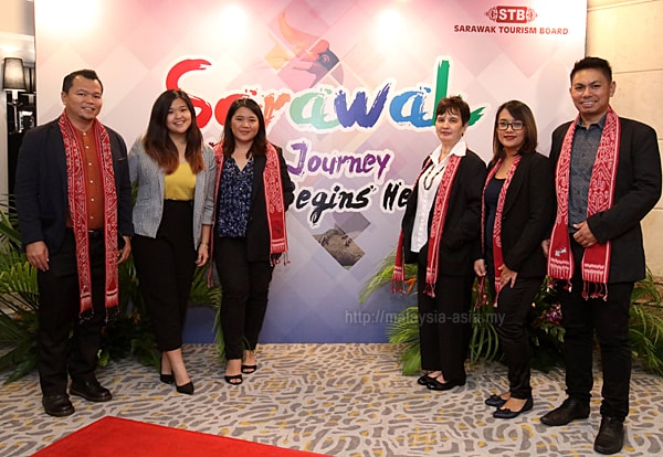 |
| The amazing marketing and communication team of Sarawak Tourism Board |
A Recent Exploration for Culture, Nature and Wildlife in Bakelalan, Sarawak
I would like to share with you a preview of my recent exploration trip to Ba’kelalan in the highlands of northeast Sarawak just this early October 2018.
On this trip, I visited the Lun Bawang community of 9 villages that make up the entire area of Bakelalan, where I spent about five days here with the friendly highland people.
Even though this is my second visit here, I learned so many new things, explored many new places and found out even more about the local Orang Ulu here.
Check out some of my Bakelalan preview photos below, which were all taken with my Oppo Smartphone on this trip.
 |
| The general landscape around Bakelalan in Sarawak |
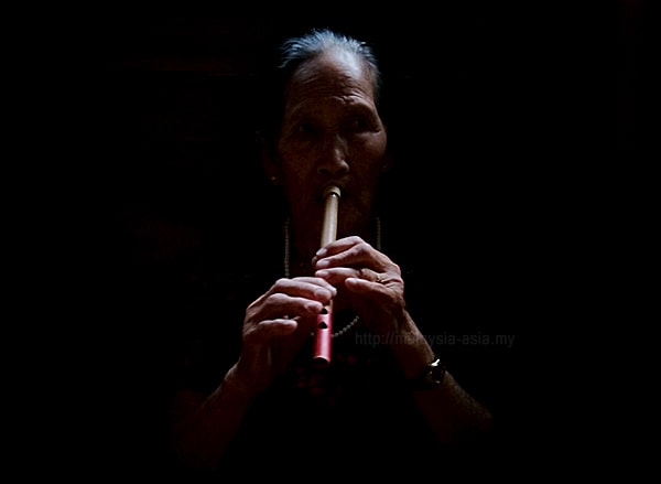 |
| An elderly Lun Bawang lady plays a bamboo flute in Bakelalan |
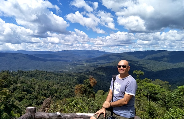 |
| Me taking a pose at one of the incredible landscapes of Bakelalan in Sarawak |
Conclusion
As I have been continuously visiting Sarawak for the last ten years since 2008, I can only share two words – Amazing Place. After visiting almost all of Sarawak, there is still so much to discover, and this is just me.
Imagine what a first timer to Sarawak will discover when he or she steps foot in this unique destination? As far as I know, there is limitless amount of adventure, nature, culture and food awaiting anyone here in Sarawak.
If you want a fast city life with shopping and skyscrapers, this is not the place to explore, but if you want a different kind of tourism experience, then Sarawak should be high on your bucket list.
And finally, I concur with the Sarawak Tourism Minister, Datuk Karim, where if you want something very unique and different, then it is recommended to visit Sarawak as there is more to discover here.